Goldcrest

Seeing Land Differently
Our challenge was to capture how Goldcrest don’t just develop land; we needed to articulate how they seek out the difficult sites, how they take on the challenges other developers shy away from, how they transform neglected plots of land into thriving communities.
![]()
Through a series of workshops, we extracted a set of key values that would underpin the brand identity. What really resonated with us was how Goldcrest see potential where others see problems, how they look at land from unique perspectives, allowing them solve the problems their competitors can’t.
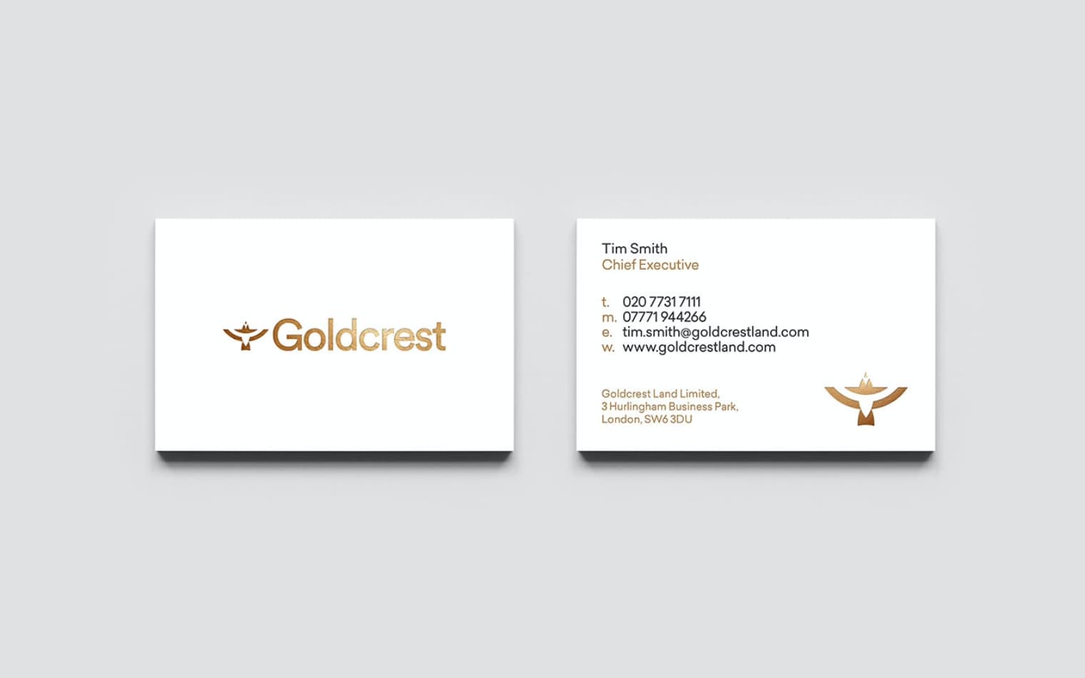
We established the tagline ‘Seeing Land Differently’. Underpinning everything Goldcrest stand for, this message informed the thought behind the visual identity. We created an icon that not only depicted the Goldcrest bird, but that highlighted the idea of seeing things from different perspectives. This icon became a dynamic graphic device used across print and web collateral.
- Share: