Where is the Love? Instilling Some Heart into Student Living
How do we create a student living brand with wellness at its core? This was the question we asked ourselves when Chicago-based company, CA Ventures, approached us with bold plans to inject a radically new voice into the UK’s student living market.
The name of that new voice was Novel, and the vision was to create a student experience built in response to a key challenge within the industry. That challenge being: what more can student accommodation providers do to support the wellbeing of their residents?
It’s a challenge that’s been left largely unaddressed within the industry. Today’s students are burdened with more pressure to perform, fit in, and succeed than any previous generation. And current student accommodation isn’t helping. Developers tend to trumpet how their housing will help students excel and live up to expectations. But all too often, those same developers fall way short on levels of service, personal and academic support, and overall student wellbeing.
Before putting pen to paper, we gave some thought to that word. Wellbeing. It’s used almost everywhere, by almost everyone, from hotel chains to pet food brands. But what did it mean for us? And how could we get beyond the buzz of the word and create a brand that truly captured the Novel vision?
From early workshops with the CA Ventures team, it was clear that they weren’t simply ticking the wellbeing box. Drawing heavily on research and market insights, they were designing environments to remedy the emotional and physical stresses bound up in the process of moving away from home and starting life as a student.
Their buildings all employed biophilic design, which places heavy emphasis on plant life and natural light, helping to reduce stress and increase productivity in those using the spaces. Every Novel building also featured a dedicated gym and wellness studio, where students could sign up for meditation, yoga and a choice of group fitness classes. The result was a holistic programme of exercises for mind and body.
And this was just the start. They planned regular social events, provided on-site mental health support, and curated a varied programme of talks on topics including nutritional advice, public speaking and mindfulness – all tailored to the most common strains and stresses of student life.
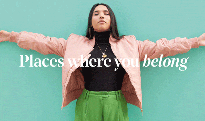
We needed to build a brand that channelled all this. In a student living market which tends to prioritise vivid colours and heavy typefaces, we wanted to create something warmer, softer and subtler, something that captured the idea that Novel was built around love.
This idea took root, and we created a simple, elegant sans serif wordmark that revealed the word ‘love’ when web users hovered over the Novel logo. When it came to colours, we chose a soft, natural palette to reflect the natural light prevalent across their developments.
With the foundations laid, we set about building a web experience as supportive and welcoming as life at Novel.
Drawing on independent research and our existing experience in the international property and student living markets, we found that users tend to search for accommodation in three key ways: name of development, name of the university, and name of town or city. We also had to consider the fact that users might not always be the students themselves. It might just as often be their parents or guardians.
Given these findings, we built the homepage around a search tool which enabled users to search by property, university or location. The intelligent search function used the first three letters of the search to predict which of these three routes the user required.
In adapting to and predicting different search habits, the landing page created a highly personalised experience. Like the wider brand, it was important to go the extra mile to support students, creating a smooth, considered journey from first web enquiry to move-in day and beyond.
Like all UK student living brands, Novel needed to appeal to the international student market as well as the domestic one. And the website was key to this. We built a multi-language functionality into the Content Management System, futureproofing the site by ensuring new languages could be accommodated at any point.
The multilingual feature gave Chinese students easy access to all the information they required. But we went a step further, too. By applying the feature to the SEO strategy, we made sure European end users were always targeted in their own language, building inclusive, considered customer relationships right from the off.
From brand strategy to visual identity to web development, it was all about creating a thoughtful, supportive, personalised user experience, an experience that embodied the love, care and commitment to student wellbeing that sat at the heart of the Novel vision.
Please visit Novel Student and take a look around.
If you have any questions about branding or need our advice on your website, get in touch on hello@steve-edge.com. You can also click through to our service pages to discover more about our working with us.
- Share: