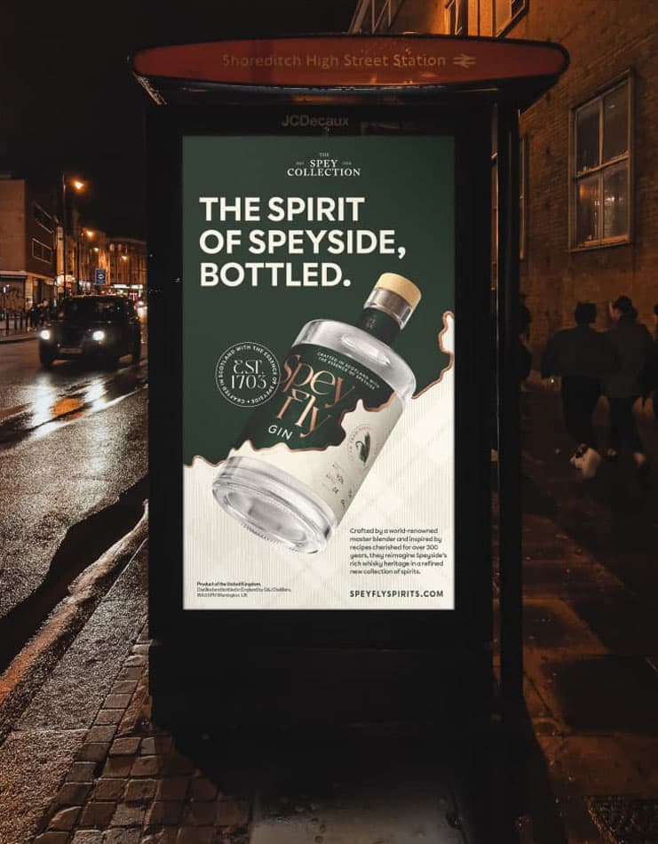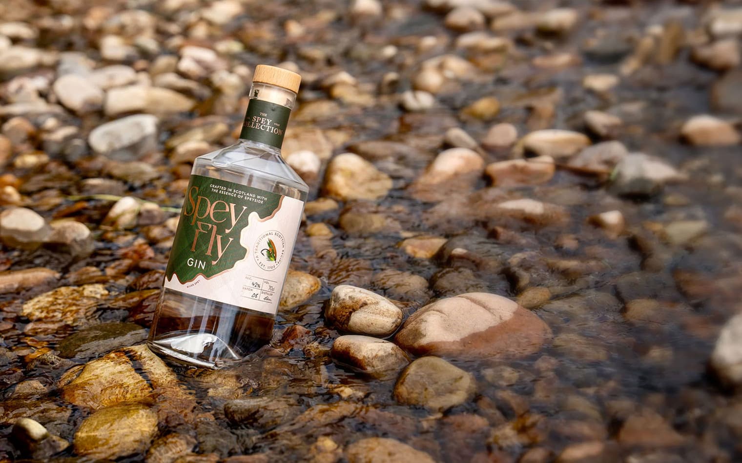

Rooted in Scotland, Speyfly Spirits wanted an identity that balanced craft, heritage and a contemporary sensibility. We drew inspiration from the river itself – a lifeline for whisky making and fly fishing alike.
To capture this story, we developed a deconstructed tartan pattern, giving a modern twist to a timeless Scottish motif. Layered across the brand world, it brings rhythm and movement without falling into cliché.

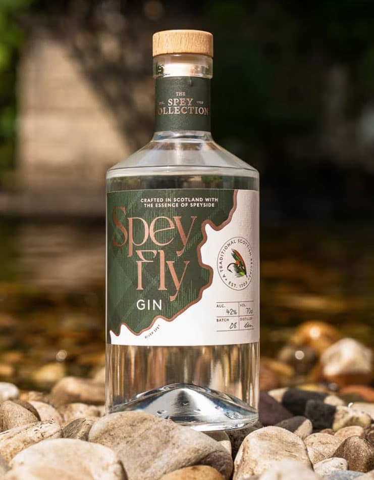
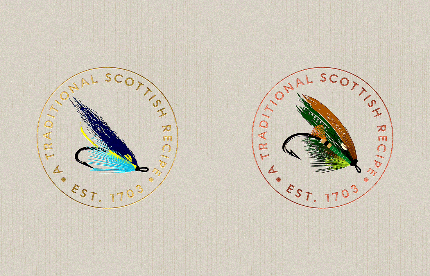
The hand-drawn illustrations of traditional fishing flies honour the spirit of the Spey, embedding the artistry and precision of angling into the very fabric of the brand.
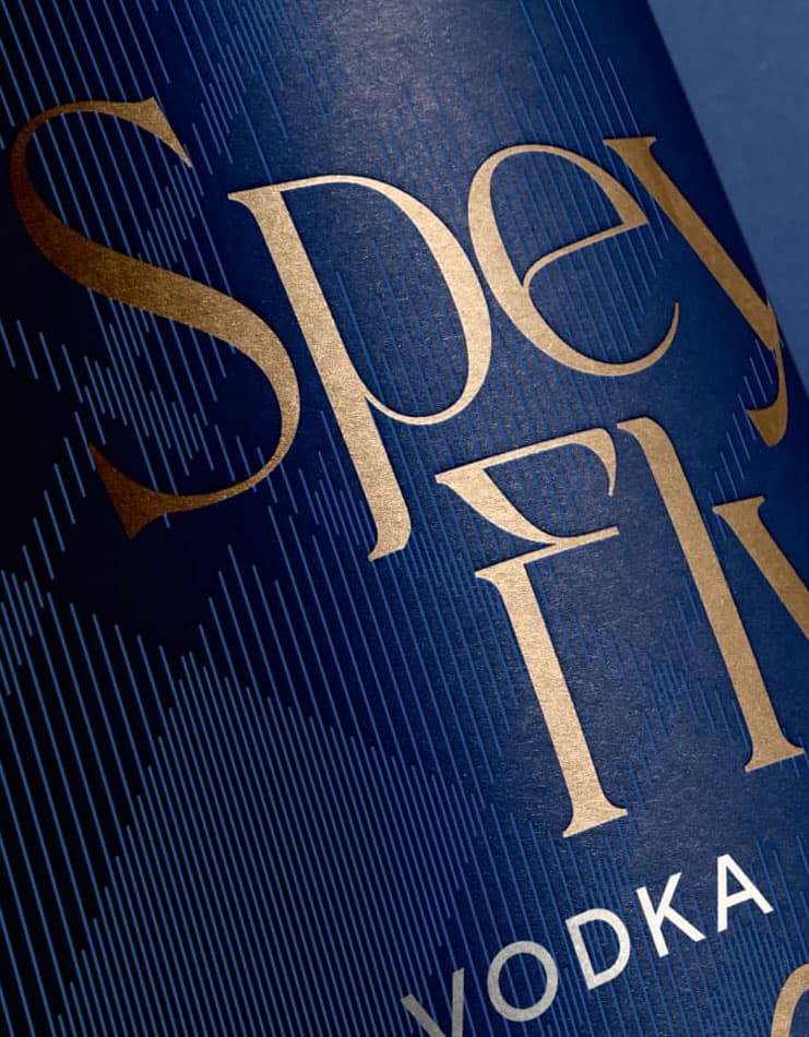
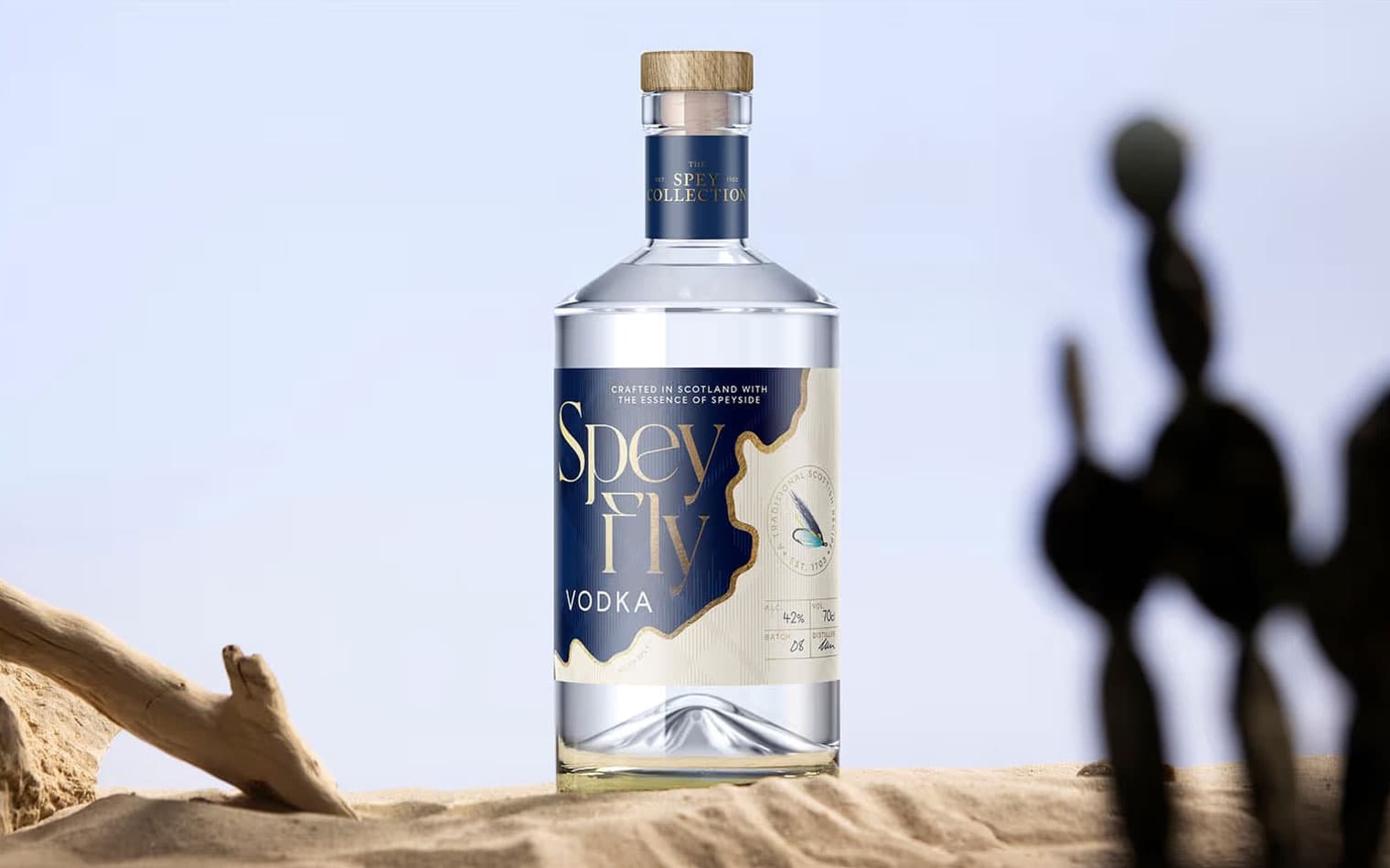
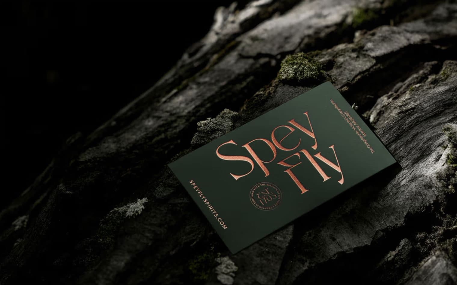
A bespoke typeface for the logotype was created, its strong, rugged letterforms echoing the raw Scottish landscape. Subtle curves within the characters nod to the fish hook, a detail that ties the identity back to the sport at the heart of the brand’s story.
The result is a brand that feels both proudly Scottish and distinctly modern: authentic, elegant, and unmistakably Speyfly.
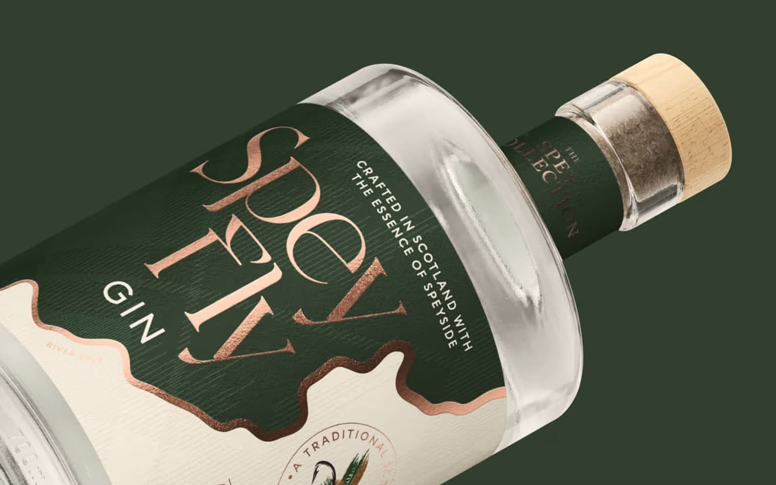
Finally, the river became a graphic device – flowing through the label, dividing and uniting its elements – a visual reminder of the waters that give the whisky its character.
