
BlueCastle Capital came to us as a new player in the Build to Rent market, with a clear ambition: launch a number of assets across the UK and capture the confidence of investors before pivoting into the B2C space.
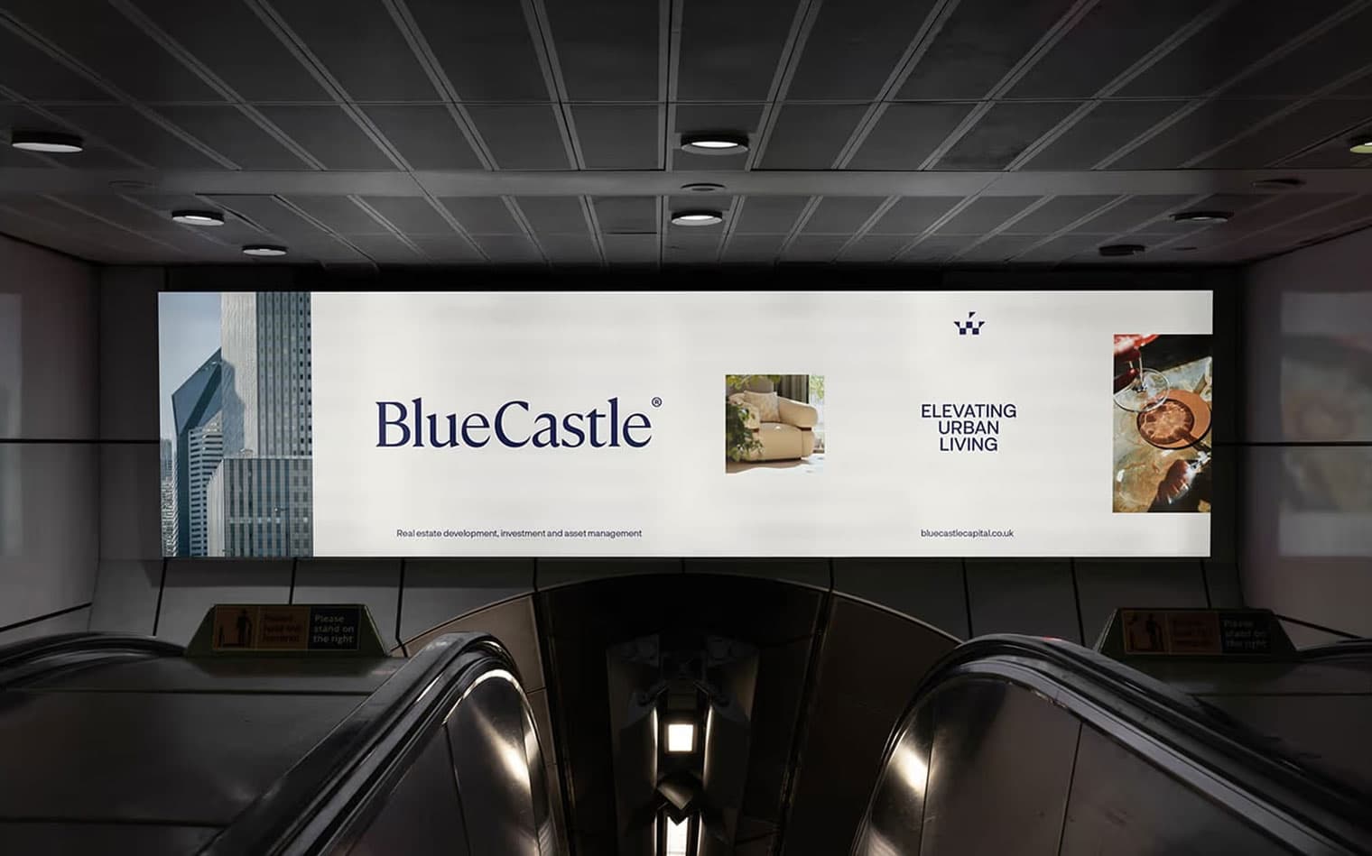
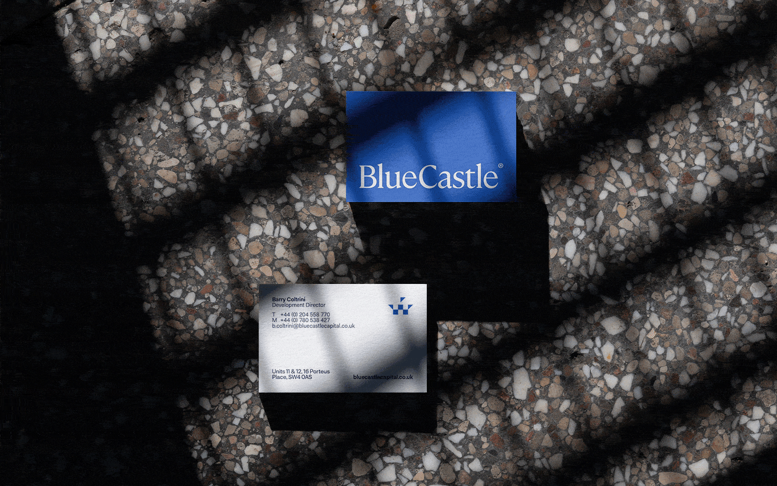
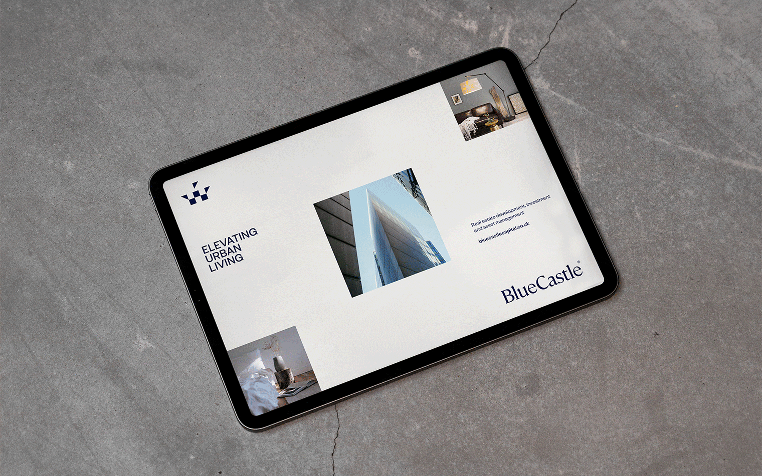
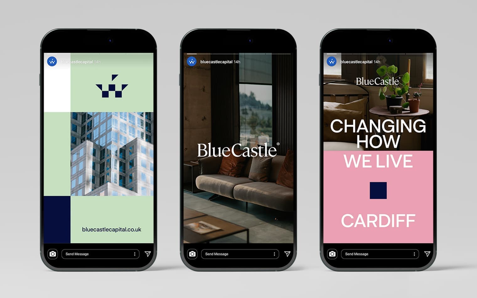
We grounded their identity in a simple, structural silhouette of a castle — Paired with a refined logotype that mirrors the clarity and authority of the icon.
The visual language extends this structural idea, with a clean, geometric graphic system that mirrors architecture in its simplicity. Anchoring it all is a bold blue palette, complemented by striking accent colours that bring energy and flexibility across applications.

The result is a brand that is confident, clear, and built to endure, ready for investors now and for residents in the future.